Scott Smith→ (Project Management, UX, Analytics, Industrial Design)
Jill Aneri Shah→ (Research Coordination, UX, Hardware Development, Usability)
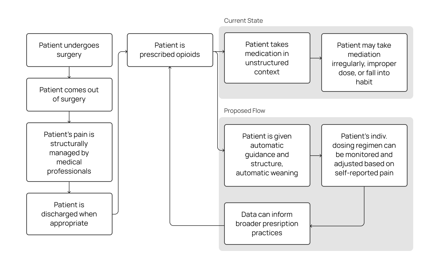
However, when patients move back home, they are often given a generous prescription for powerful yet addictive opioid-based analgesics (painkillers). Unlike the experience in a controlled hospital environment, patients are suddenly faced with the need to regulate their own pain medication while they recover. The combination of over-prescription, ineffective self-regulation, and a lack of awareness of drug return practices has contributed to an opioid crisis that has claimed more than 42,000 deaths and two million cases of opioid abuse in 2016 alone.
This project is an investigation into bringing the concept of patient-controlled analgesia into the home. Ultimately, this project aims to address, at least in part:
-
Lack of education and the resultant anxiety around proper management of pain at home
-
Historically overgenerous prescribing practices of opioids
-
Dosage vs. relative effect of a given painkiller is different for each patient; current one-size-fits-all approach does not accurately account for these difference
-
Lack of visibility into a patient's actual use of the opioids
-
Lack of ability to accurately step a patient down from opioids without significant confidence from the patient or time-intensive guidance from the doctor,
-
Low return rate of unusued opioids – unused opioids may abused by non-patients who find them in the home or may be illicitly sold
Contrastingly, the use-case for Recap PCA would be short-term management of controlled substances, none of which the competitors addressed.
Some key quotes:
-
“In the open-ended response portion of the survey, patients commented on this ambiguity with the following comments: “anxious on whether or not to hit the button,” “left in the dark,” “making the pain worse,” and “always in pain because I never knew if I was actually getting any medicine.” The ambiguity around pain medication delivery and the denied attempts during the lockout period may contribute to patients’ perceptions that the PCA is an unreliable pain treatment modality.”
- Patak et. al, 2014 -
“In summary, the Abbott PCA Plus II interface does not conform with existing human factors guidelines, thereby unnecessarily increasing both the demands on users and the probability of human errors.”
- Lin et al., 1998
-
Patients are not entirely familiar with proper pain management
-
Over-prescription is not uncommon, as there is no data to inform prescription amounts on a per-patient basis
-
Error-recovery methods in existing medical devices is currently a large pain point
-
Medical interface design is not always consistent, leading to errors when using competitor products
-
Social implications of medical devices must be mitigated, such as having a medical device on display in the home.
This approach was approved by our stakeholders, and address a number of issues:
-
Being able to guide and monitor a patient with their own reported experiences (dose vs. individual experience of pain) allows healthcare professionals to better tailor prescribing practices to individual experiences and help prevent abuse
-
Automatically step down a patient from opioids to non-opioid painkillers to help prevent addiction
-
Preserving the agency of the patient, and still allow for use of opioids when necessary.
-
Patients having to report their pain levels regularly increases mindfulness of their dosing regimen.
-
Connected device surrounding use and dosing data can provide robust data to inform broader dosing practices of opioids
-
Return of hardware at end of recovery can improve the return rate of unused opioids, rather than having unused opioids lay around the patient home
We physically 3D-printed more than 25 different versions of internal dispensing components, form factors, and other ideas.
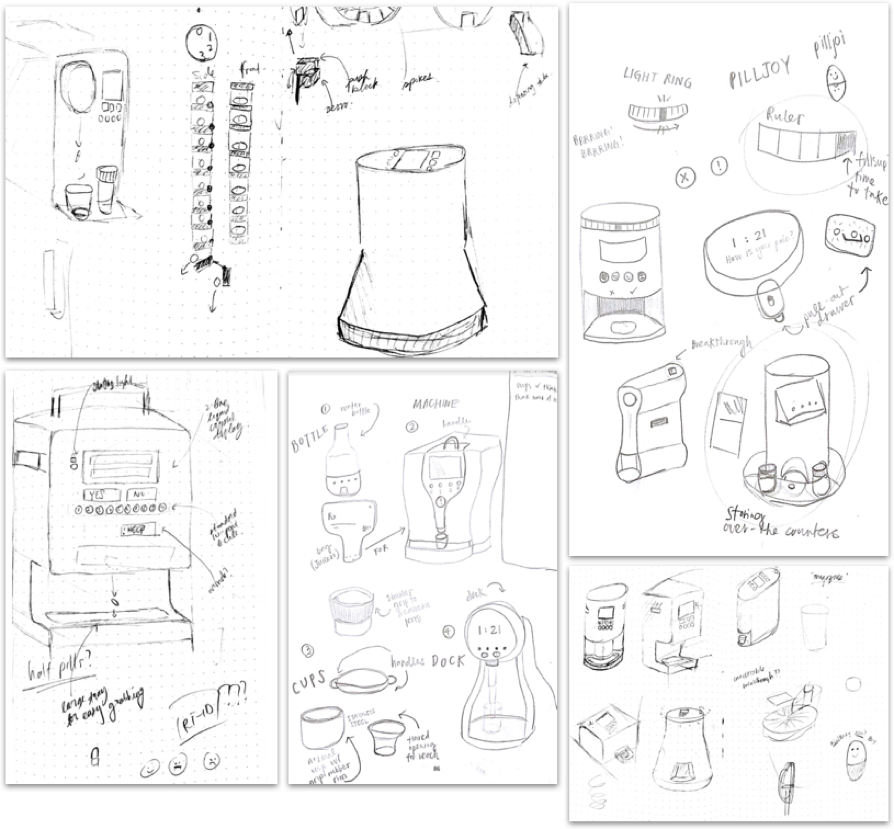
Top-left: dispensing mechanisms, circular/cylindrical designs, “Nespresso”-inspired pill dispenser; top-right: notification ideas, integration of pill bottles; bottom-left: inspired by a coffee machine, integrating a handle, locking mechanism, hand-accomodating pill dispenser; bottom-center: pill bottles, machines, cup designs, novel designs; bottom-right: interface integration, form factors, integration with dispensing mechanism
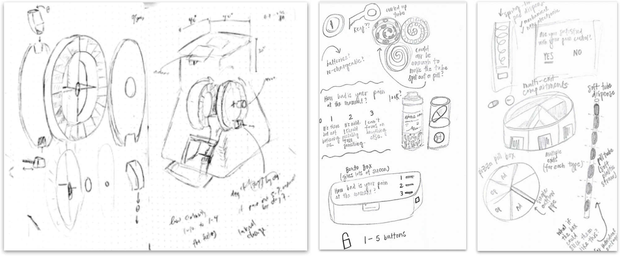
Left: exploded diagram of an upright circular mechanism, integration into a form; center: Circular-feeding, pill-bottle based, etc.; right: Various dispensing mechanisms, including circular, linear-feeding, and spring-loaded
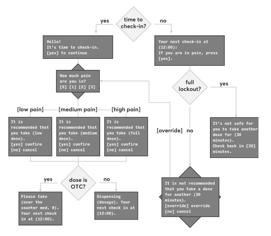
The user flow was based on three core concepts: self-reporting of pain level (via a numeric pain scale), a resultant recommended dose type / amount, and final selection by the patient of the actual medication to dispense.
A key part of the experience outside of the "golden path" of just collecting data, recommending, and dispensing is the number of secondary cases that relate to improper opioid use (not safe to ingest n amount of medication within a given timeframe) and patient agency (a patient should never feel as if they are truly unable to dispense medication if they really need it).
A preliminary, recommendation-based user flow was developed and tested with stakeholders, creating a flow that not only completed the desired task, but navigated existing power structures in a medical environment.
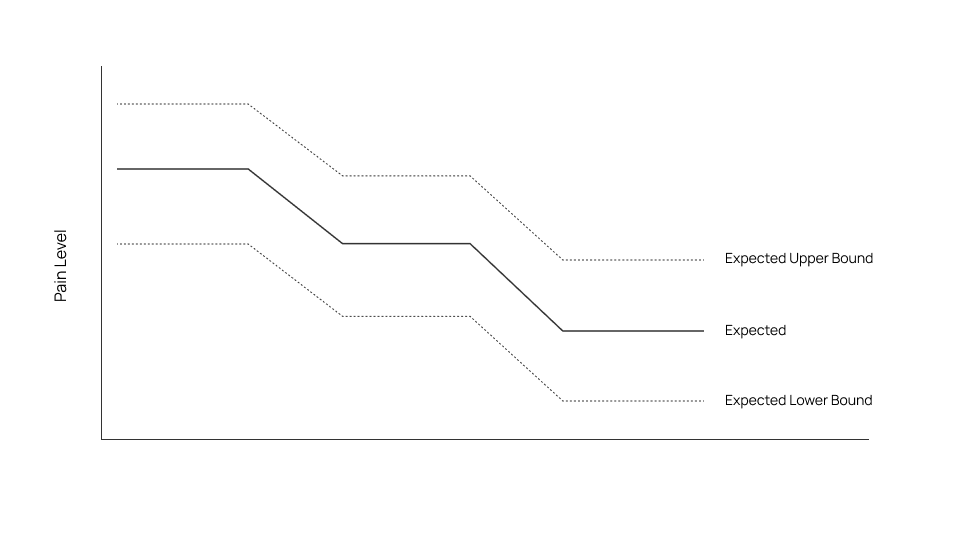
Device would be able to inform such a graph, to check for significant deviation from the “norm” and identify erroneous incidences of pain and/or pill dispensing
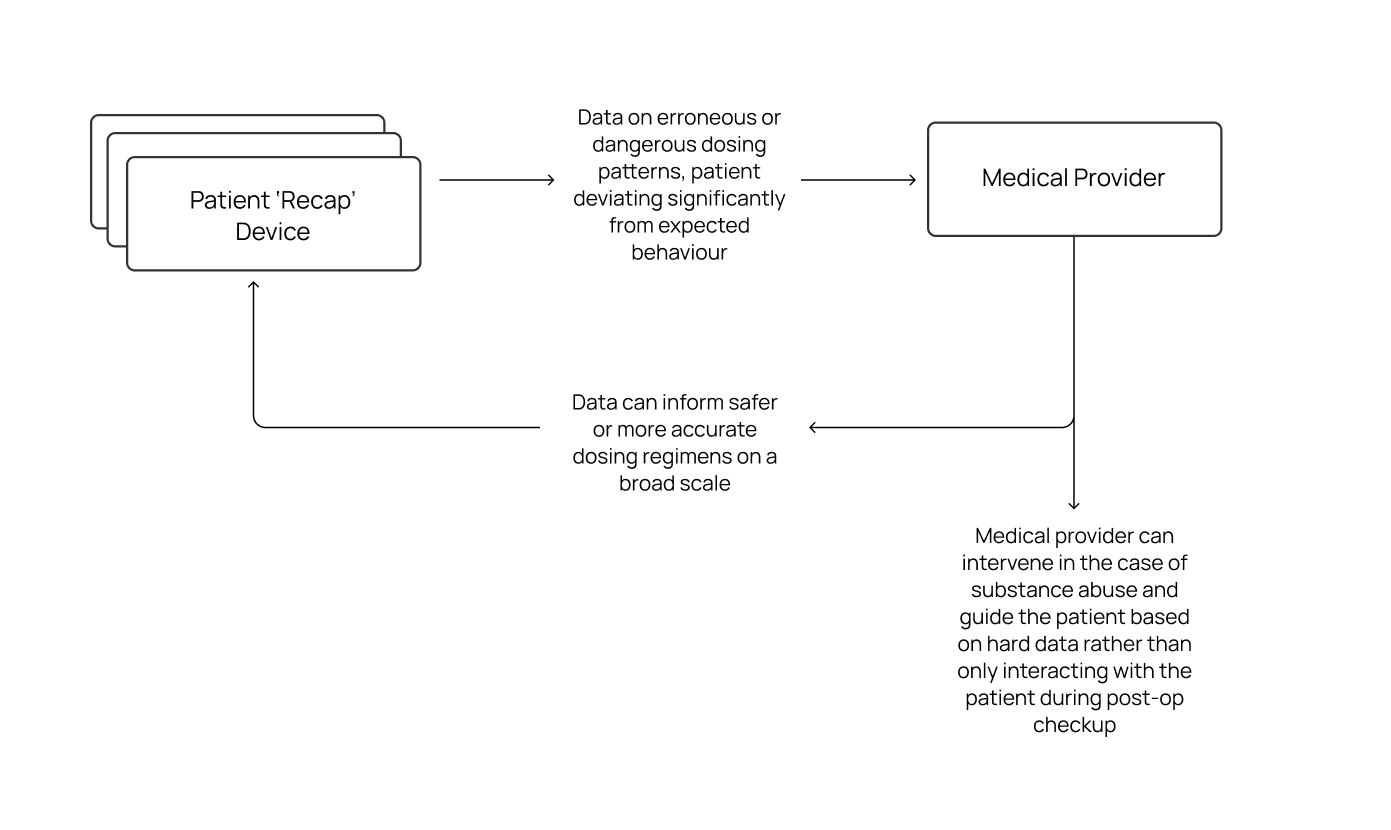
How the data could be used to both intervene in erroneous dosing situations and/or inform future dosing regimens.
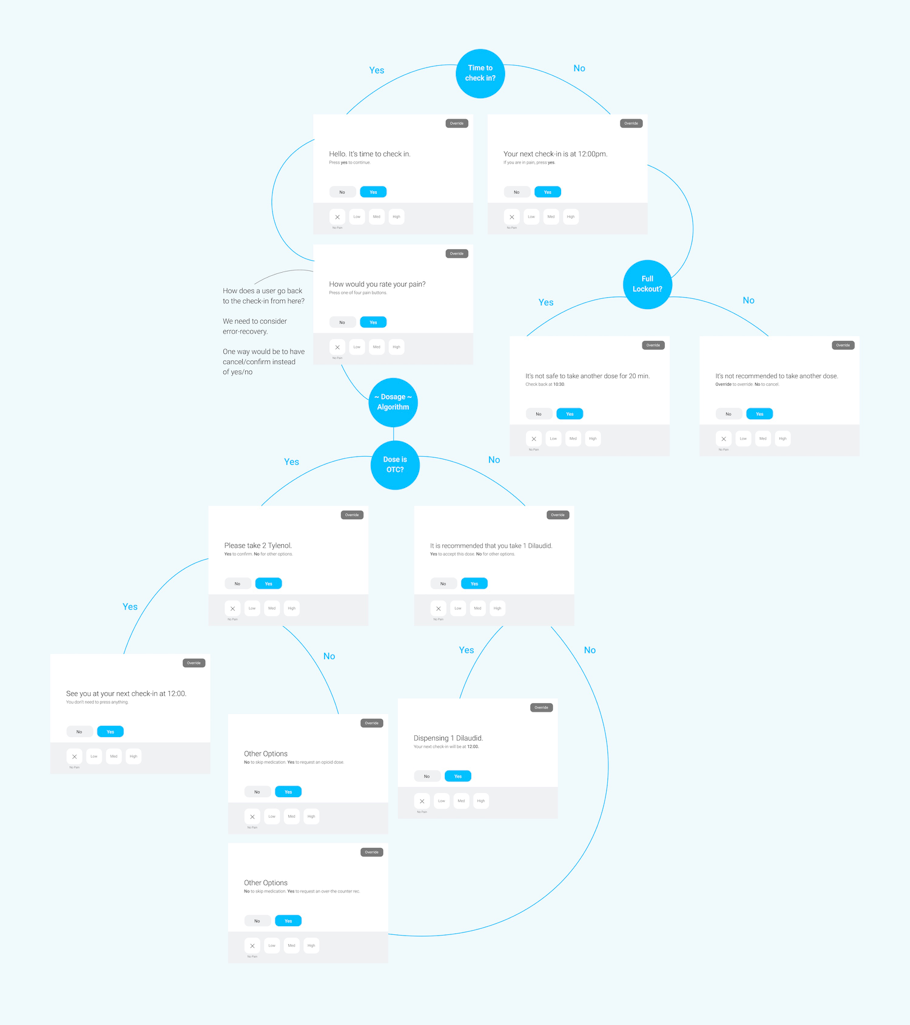
This UI was tested with users on iPad via a Figma prototype. To keep manufacturing costs low, we initially proposed a UI with a non-touch screen navigated by seven buttons (X, low, med, high, no, yes, and override) but quickly found in testing that the "simplicity" created more problems than it solved – a touch interface was preferred by users.
-
Error recovery needed to be improved; allow for
exploration of the UI without penalty -
Streamline the user flows and make each path clear
-
Eliminate the “other options” page
-
May need to intentionally shift UI elements to prevent mindless tapping
-
Pain scale is a good choice
-
Explicitly telling a person which button to press may not be necessary
-
Only show “override” when necessary
-
Improve visibility of active vs. inactive buttons
-
Revise flow again to find out where a prompt can be responded to in alternate ways
-
Clarity is good and can be used properly by people of all backgrounds, ensure that this is continued throughout the rest of the UI
-
Need to improve error recovery flows
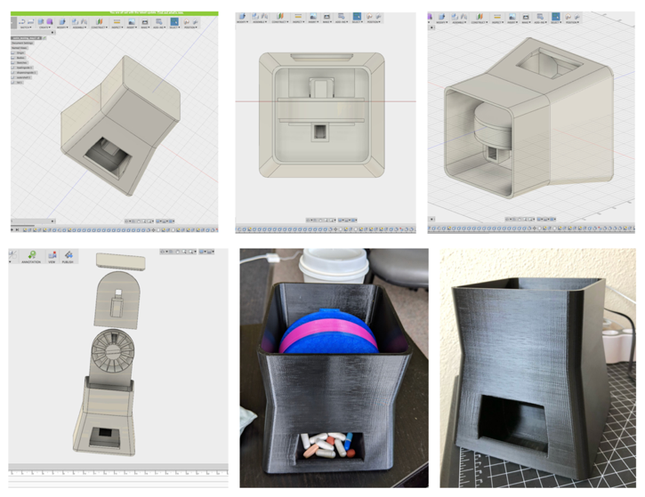
Sample 3D digital models and 3D printed full-size prototypes of the device with preliminary dispensing hardware for use for testing.
-
Moved away from numeric pain scores to more patient experience-oriented pain scores backed by clinical research – we used the 'Wong-Baker Pain Scale' that is more explanatory and mitigates some of the phenomena of patients 'under-rating' their actual pain.
-
Moved away from a non-touch screen UI navigated by physical buttons to a full-touch UI as the complexity of the pain scales and overall flow (including "override' functionality) were not achieving high enough success with physical buttons.
-
Override functionality was revised to only be shown when necessary to increase its importance when such functionality is needed and/or available.
-
Error recovery was fleshed out and the flows were reworked to be always recoverable until the user confirms they want to dispense a pill.
-
Eliminated "Other Options" page and removed/integrated said features into the flow where appropriate instead.
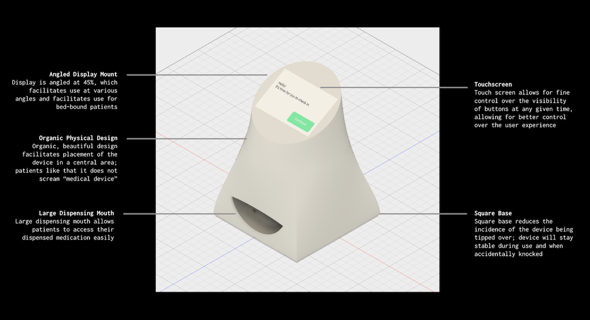
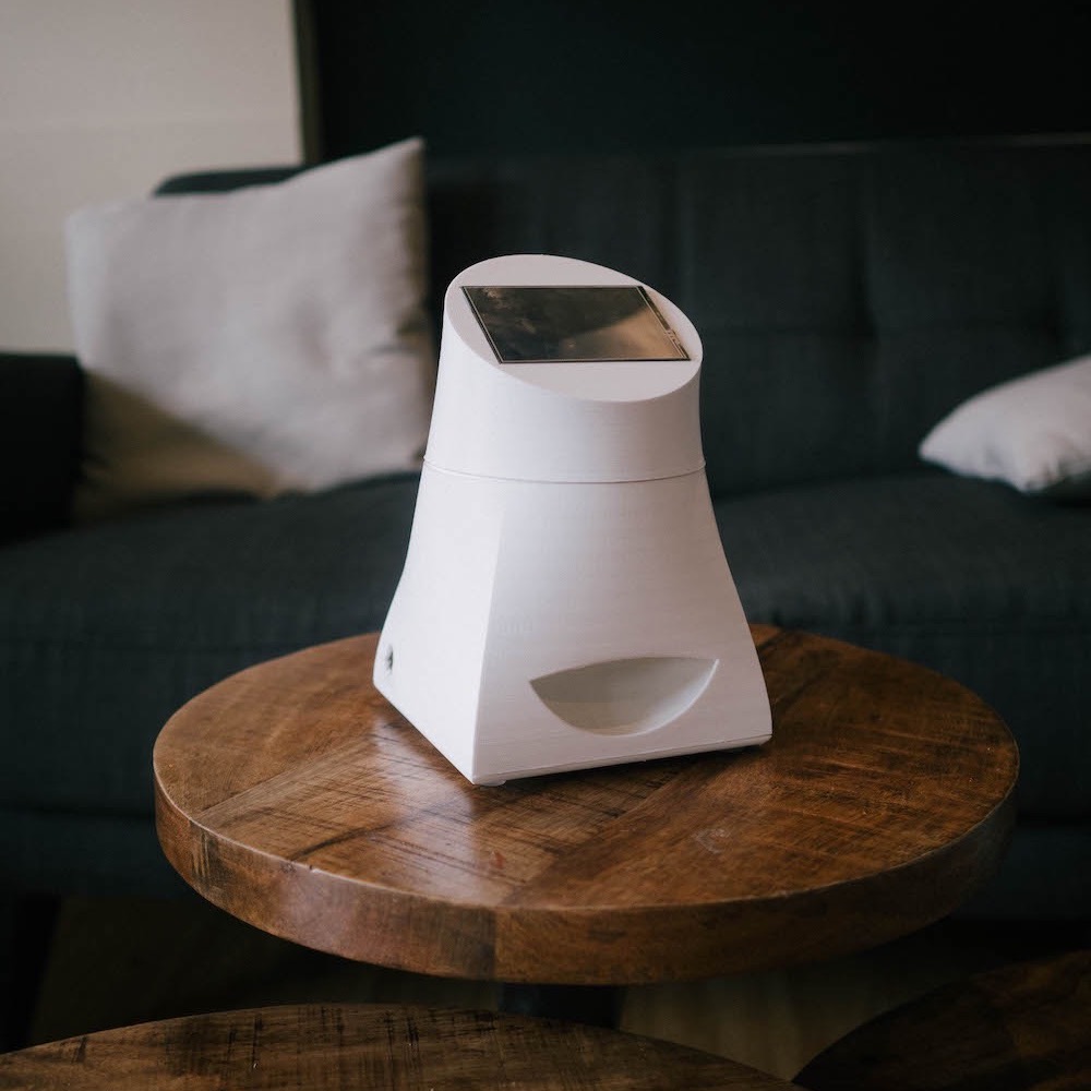
The final design has a more organic design with a large dispensing 'mouth' and angled touchscreen for optimal use.
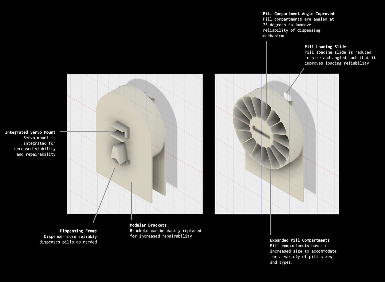
The internal prototype dispensing mechanism was also fully built and prototyped both from hardware and software perspectives. This design is static, but could be adapted in the future to have a removable or disposable "tray" of pills for quick set-up at the pharmacy.
This is a fully-functional UI (per UI flow below) built on an Arduino Mega 2560 and off-the-shelf hardware in native C++. The dispensing mechanism is also functional for one full loaded rotation.
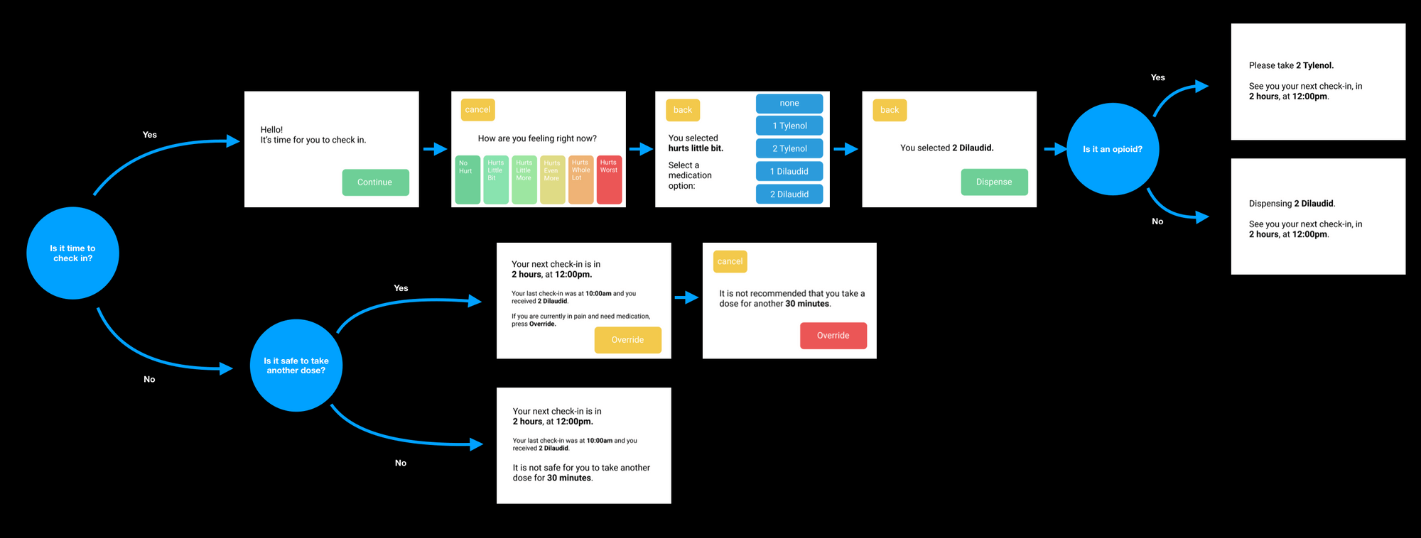
The UI is split into two primary paths – a "time to dispense" path and a "not time to dispense" path. We optimised for clarity and error recovery at every stage.
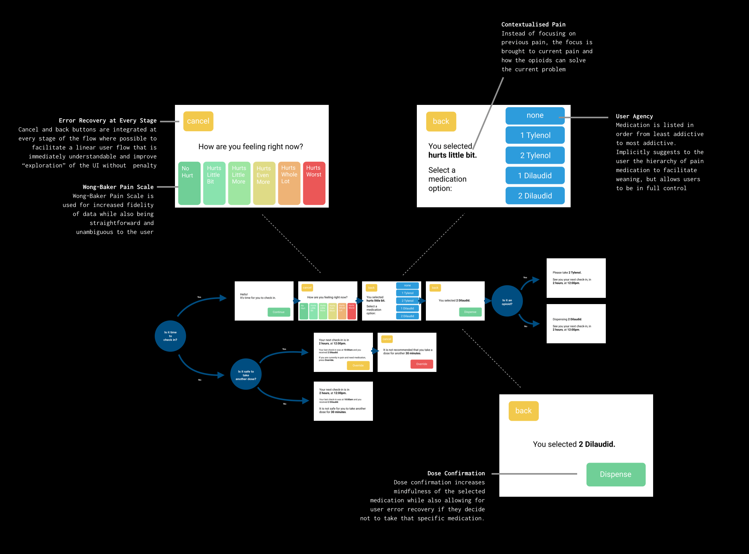
We use a Wong-Baker pain score to capture the most accurate yet personalised experience of a patient's pain, avoiding the pitfalls of "relative" experience of pain (e.g. a basic numerical score, where patients regularly under-report their pain). We keep it clear and prioritise patient agency. We're not able to make recommendations, but center the experience around reflexivity.
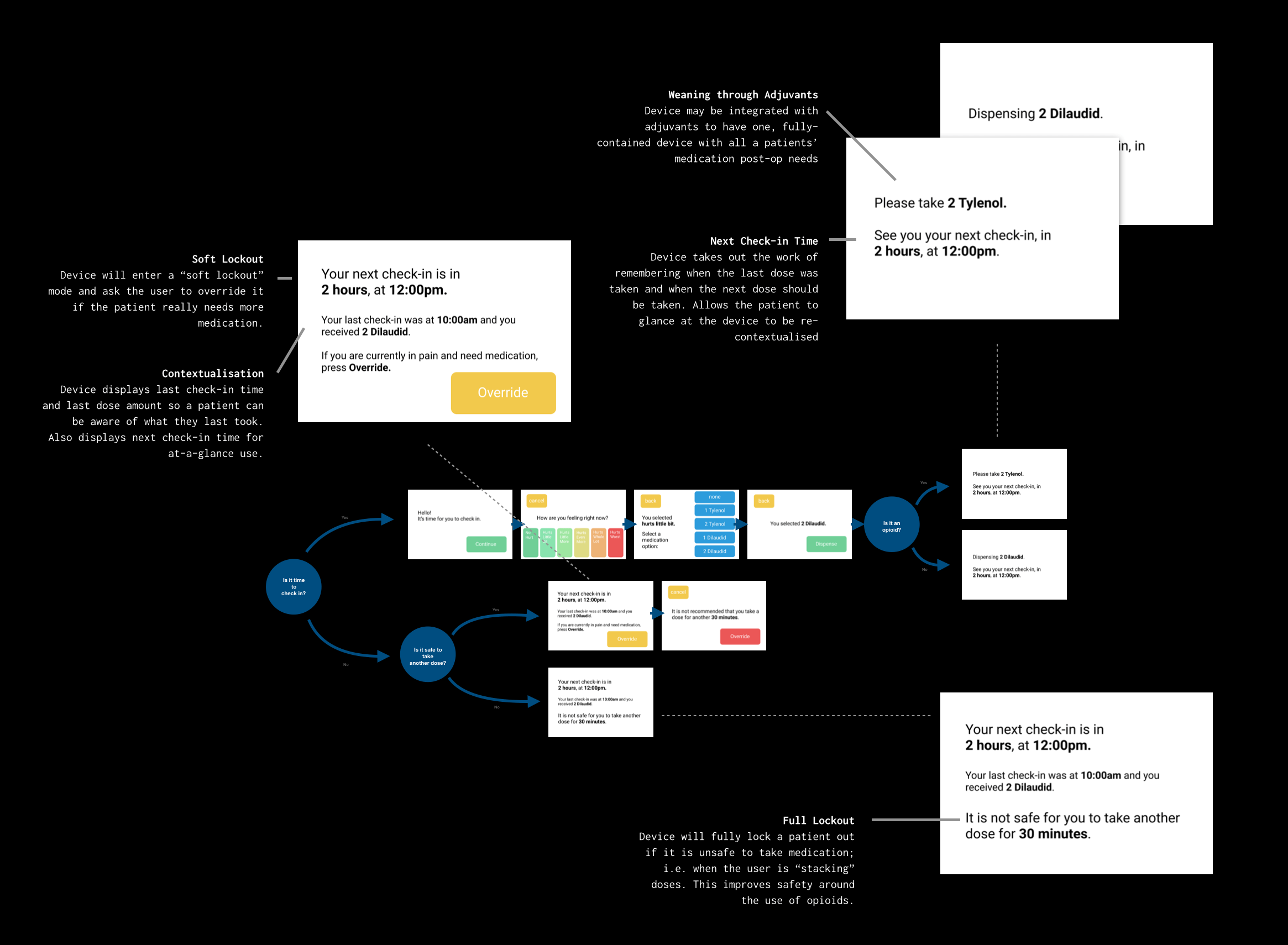
We have both "soft" lockouts and "hard/full" lockouts. Hard lockouts are exclusively reserved for scenarios where it is physically unsafe to take another opioid. "Soft" lockouts can always be overridden in the case where a patient is in pain and does require more medication.
In terms of expanding the current functionality of the device, there are also a number of things to be addressed. Feasibility, device ownership dynamics, and mass-market loading techniques, among many others, must be fleshed out before this product can reach the market. For example, loading techniques such as pre-filled "wheels" that could be loaded like a cartridge by a pharmacist must be explored if this is to be used in any sort of mass-market setting. Ownership dynamics must also be explored: is this a device that a patient would rent from a hospital, pharmacy, or buy outright? Would this be paid for by insurance, and what motives are there for insurers to pay for such a device? Other not-so-obvious things such as how the device would be cleaned between different patients must also be explored, along with managing critical reception from medical professionals and administrative bodies such as the FDA– especially since this device is built to work with controlled substances.
As this is a proof-of-concept and not yet a production-ready, FDA-approved device, some of these limitations are understandable. However, this project is valuable more broadly in exploring and attempting to address these issues around outpatient opioid use (and the root causes of abuse), education, and dispensing practices.